Brochure Concept
Within the publishing world, not all publications are books (defined by Unesco as those printed over forty-nine pages, not counting the covers). There are also smaller publications, such as brochures, which must also respond to certain characteristics.
Based on the definition of Book, issued by UNESCO in Paris in 1964, and ratified in Sofia, Bulgaria in 1985,any publication whose number of pages is less than forty-nine will be considered a pamphlet. Within the editorial history of the eighteenth, nineteenth and twentieth centuries there have been important pamphlets, since almost all historical, political, artistic and literary movements have chosen this way to disseminate their proposals, manifestos and works.
Types of Brochures
Over time, however, the concept of booklet has expanded beyond the number of pages it must have, even though that is the main canon that separates it from the books. In this sense, according to the statutes established in Editorial Design (more information in What is Editorial Design?) and in Text Editing, it can be considered that within publications called brochures, there are at least six different formats, depending on the number of pages, diagramming and objectives each of these printed ones.
Among the types of brochures that publishers and printing presses handle today, we have the following:
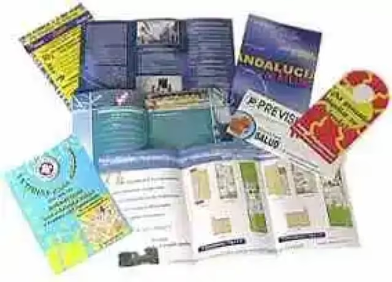
Flye or Flyer: This publication is characterized by being printed on a single sheet, sometimes half a letter or a quarter letter (which in editorial terms could be named as 1/16 or 1/32 taking as reference the measures in the spread). Usually only one of the modules is printed, and in some cases the two.
Diptych: This is a publication made in almost always on a letter-sized sheet (i.e. 1/16) which through a fold manages to achieve four faces. Usually absolutely all faces are printed.
Triptych: In the case of the triptych, which is also printed in 1/16 or 1/8 of spread, it is a publication consisting of six sides, which are achieved by making two folds on the leaves. Like the diptych, all its faces, i.e. shot and retreat, are printed.
Quadriptic: This is a publication, usually also printed on 1/16 or 1/8 of spread, which through three folds manages to achieve eight sides, which are fully printed.
Polyptych: this is a publication to which, in print, four or more folds are made, giving rise to ten or more faces, which are fully printed. They are usually printed in 1/8 or half spread, since in smaller sizes the source number would be quite small, although when making the folds, we can have a brochure of 1/16 or 1/32 of spread, which when opened shows us all its faces.
Pamphlet: With this name is known today, what at the beginning of the editorial history was known as a brochure. In this sense a pamphlet will be all that publication that consists of more than six pages, but less than or up to forty-eight, which will also go on horseback, that is, stapled, never bound as booklets.
As for their sizes, they can be several from 1/32 spread to 1/8 spread (preferred size by magazines) although usually the standard size of the pamphlets is 1/16 because it is the most economical, as it saves paper, and is easier to produce for printing presses.
Brochure Features
Despite having six different formats, the booklet in general has certain characteristics that are common to each of the manifestations of this editorial genre. In this sense, we could say that the main characteristics of the brochure are as follows:
Printed publication less than forty-eight pages, that is, covering publications consisting of from one page to forty-eight.
Printed text for the purpose of reporting accurate data, so its content is usually reduced, summarized and sometimes written in technical language, since brochures (on all diptychs and triptychs) usually have the function of informing a specific public on a topic of interest.
Currently, brochures (especially diptychs, triptychs and quadripletics) are used internally by companies, to inform their management and services, both to their employees, as well as customers.
Its content is characterized by being as clear and accurate as possible, without the text blocks being extensive.In fact they are almost always short and concise, being presented more as items than as paragraphs (in the case of flayers, diptychs and triptychs).
Another of the basic features of the booklet is that, unlike the book, they are small throwing (i.e. very few numbers are printed) and its printing is done only once, because having a specific objective and audience, its validity is reduced to a single axis run mplares.
Previously, its print quality was considered as an essential feature of the brochure, now aday with the development of virtual platforms, publications that adapt to the aforementioned formats, are printed in published on digital platform.
Brochures make great use of images. Because they are informative and technical texts, their editing usually makes use of a large number of images, also to make their textas concise and didactic as possible, because the ultimate goal of the brochure is to inform efficiently and quickly the reader, so both the designer and the publisher must keep in mind the achieving a product where the information is arranged in a way that reader can quickly learn about what is wanted to be transmitted.
Currently, in addition to the internal use of companies, the world of advertising makes constant use of brochures (especially flayers and diptychs) to make propaganda and dissemination of its services. So some designers or publishers consider that one of the basic features of the brochure is to serve as an advertising medium.
Image source: hurlighan.anuniosgratis.com
