Before Launcher, a launcher more minimalist in that you can only add eight apps
The application launcher is probably the app most important in Android, and although there are those who prefer to have the more features the better, also there is a place for the launcher minimalist. Before Launcher is a new one and what’s more minimalist that we’ve seen in a long time.
By having, Before Launcher you do not have almost and icons, because the main screen is composed of eight links to applications that are using the name of the app instead of its icon. The offer is completed with an integrated view of notifications where it separates the chaff from the grain to only show you the most important.
Eight apps, what do you want more?
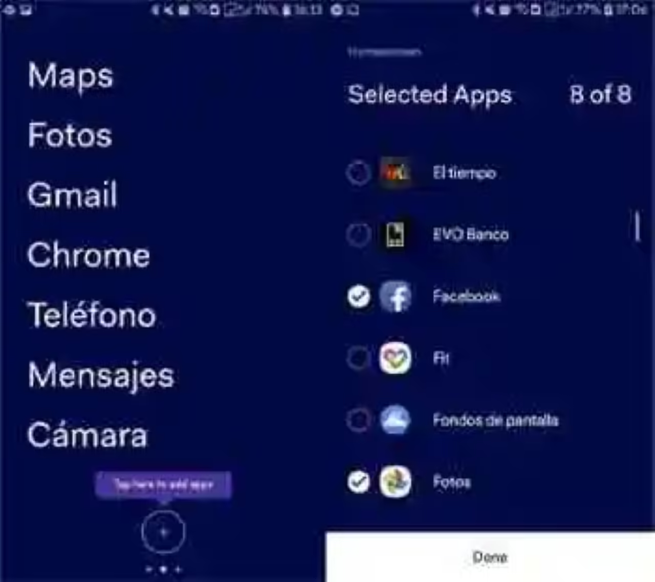
When we say that Before Launcher is a launcher minimalist, not what we say, for to say. The main screen of the same allows you to add eight applications maximum: not one more. For make easy the task, the launcher starts the series with a few pre-selected among the basics (Maps, Phone, Messages, Camera…) so I really have little space to add others.
Xataka Android
A month feeling guilty because of the ‘well-being’ Digital Android 9 Foot
fear Not, this does not mean that the other applications are inaccessible. The launcher consists of three pages, being the middle of the main, with the eight shortcuts, and the page to the right side of everything is app drawer. Here if they are all ordered alphabetically, and with their icon.
The fact that the main applications -the eight fantastic – to display with a big text and no icon is how much less interesting and has the side effect that you might be less tempted to open another app with which to waste time. Of course, it is a method a little radical, and there will be some who love it and who hate it.
Notifications, the fair
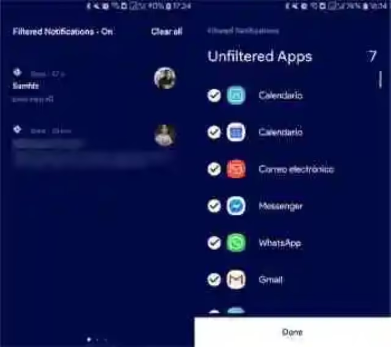
We have spoken before of a page for notifications, but what is it? It could be said that it is something like a notifications panel integrated, but the main advantage is that notifications are filtered in most applications, showing only the most important.
once more, Before Launcher has the nice detail of pre-selecting a handful of apps whose notifications will not be filtered, as is the case of WhatsApp or Facebook Messenger, although you are free to remove or put on as you prefer. The goal is the same: minimize distractions.
Visually, it is a launcher curious-you can change the background color in the settings – although it is clear that not for everyone. If you are interested in the Wellness Digital Google, a launcher is a good complement to restrict the use of mobile phone.
Before Launcher – Reduces Distractions
- Developer: Before Labs
- Download: Google Play
- Price: Free
- Category: the Customization
You can also look for…
The Samsung Experience Android Launcher Foot, available for any Samsung with Oreo
You to your house and I to mine. What are the individual houses, the future of the couples?
Tried a LITTLE Launcher, the new launcher 'Made in Xiaomi', already on Google Play [Updated]
–
The news Before Launcher, a launcher more minimalist in that you can only add eight apps was originally published in by Ivan Ramirez.
